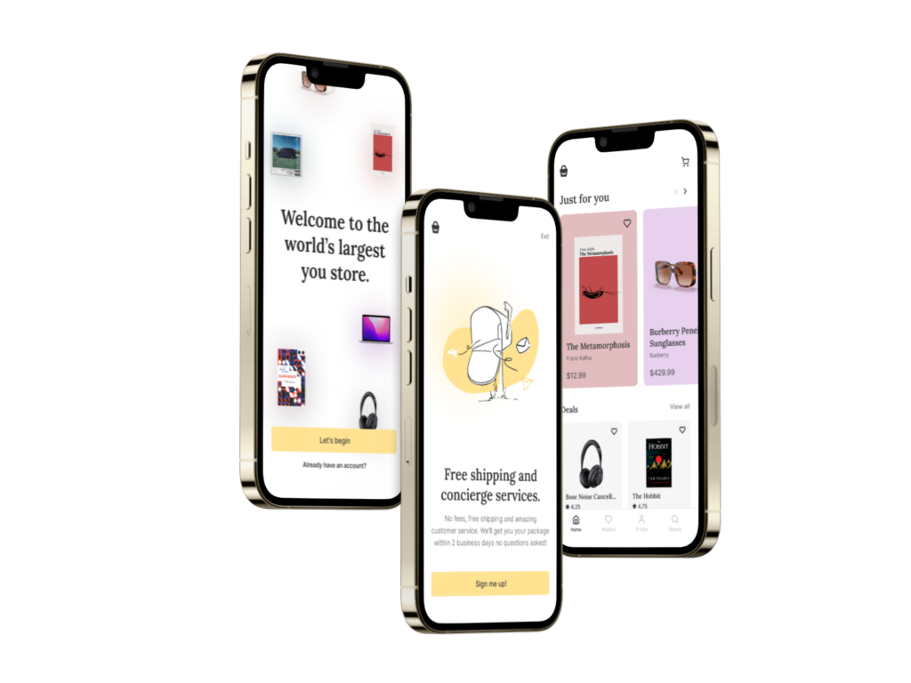
The purpose of this project is to simplify the online shopping experience. Often, similar applications bombard us with nonrelevant information, which makes us overwhelmed, thus making us leave without buying what we need. The idea is to create a seamless online shopping flow, showing customers only what they need and leading them to the checkout without distractions.
Solo designer.
This is a concept project showcasing how I would approach designing a new mobile application for online shopping. Everything was done in Figma.
The animated prototype above shows the onboarding process that will lead customers to select their interests in a few simple steps. This allows us to show only relevant products for each customer, making it a more pleasant experience.
Since the purpose of the onboarding process is not to give customers a few extra steps before they can use the app, there is a secondary button to skip the whole process and get straight to shopping. They can always set their interests later.
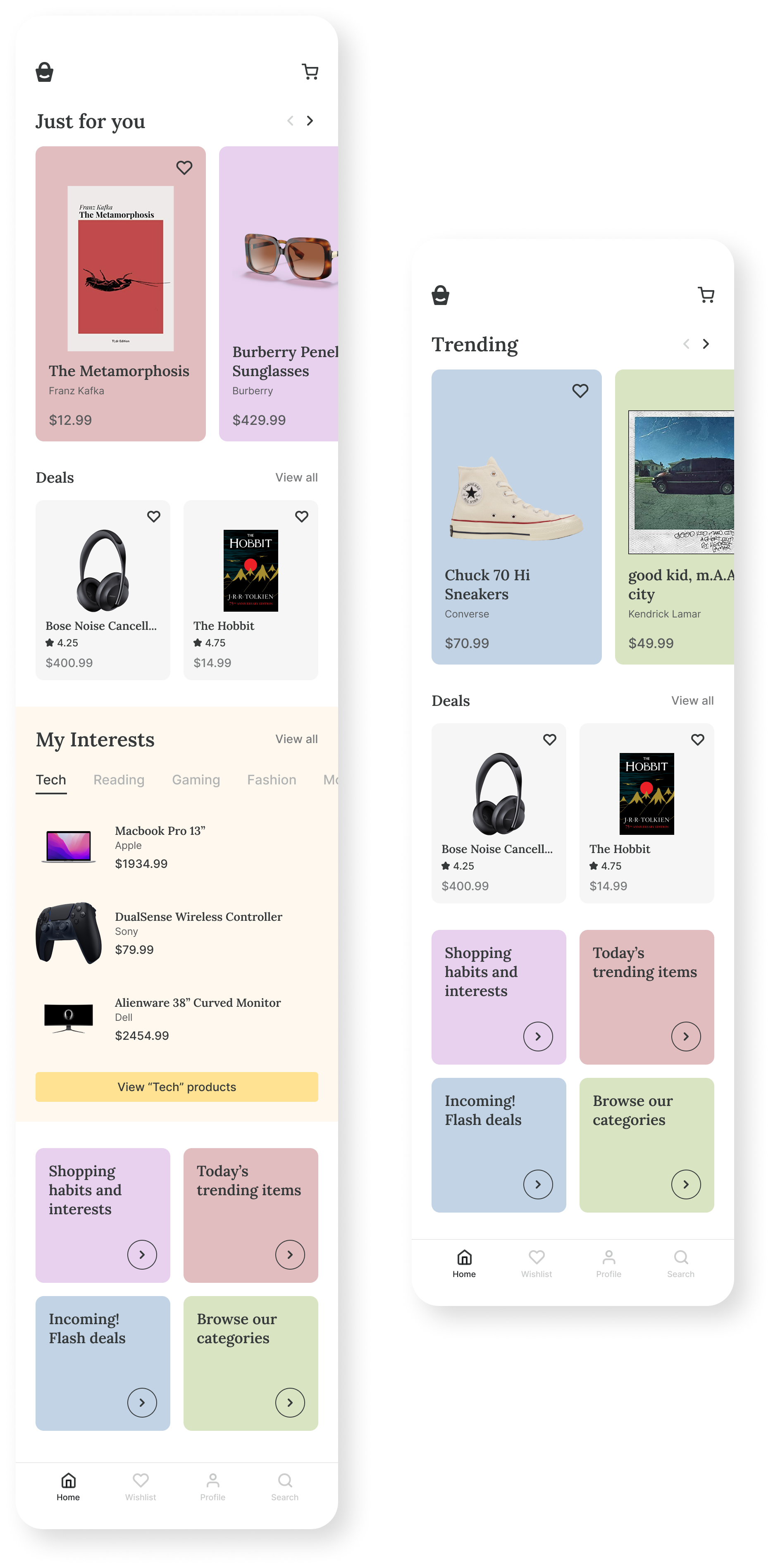
To make a more personal approach, I decided to design two home screens - one for members (left screen) and one for non-members (right screen). The member screen allows the user to view his interests after he selects them during onboarding or later on and to put those products directly in a cart. That way we get to present to each user what he wants and needs, which leads to more conversions.
The idea of the cart and checkout flow is to be effortless. There should not be unnecessary information or steps, just a smooth flow, each step leading to the next. Once the user selects his product, the cart overlay shows up, which allows him to manipulate chosen products. After he clicks on the “Checkout” button, he is taken to the checkout page, which is purposefully minimally designed for the user to have as few distractions as possible. In the end, he gets a confirmation message about a successful purchase.

At first, I made a product page with reviews showing up as a default, thinking that it could make the user more likely to buy, especially after reading about positive experiences.
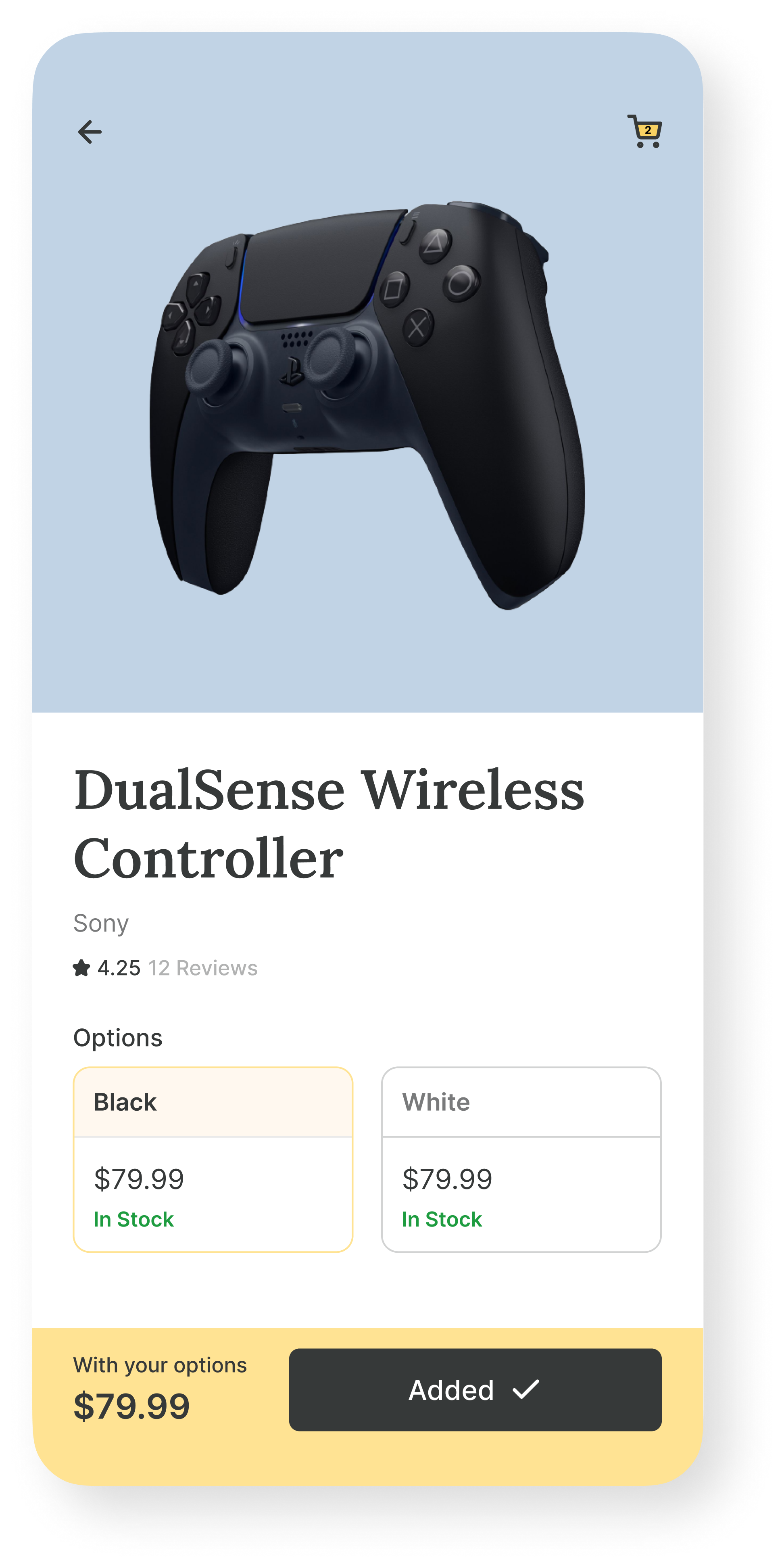
Later in the project, after some consideration, I decided to hide reviews to make the product page as simple as possible, with the idea of fewer distractions and more conversions. Users can still go to the reviews by clicking on the "Reviews" text below the product name.
Following the theme and idea of the whole application, in the categories screen users can select and deselect categories they are interested in. The application would use this data to show each user products he is interested in, which would lead to more products being bought.
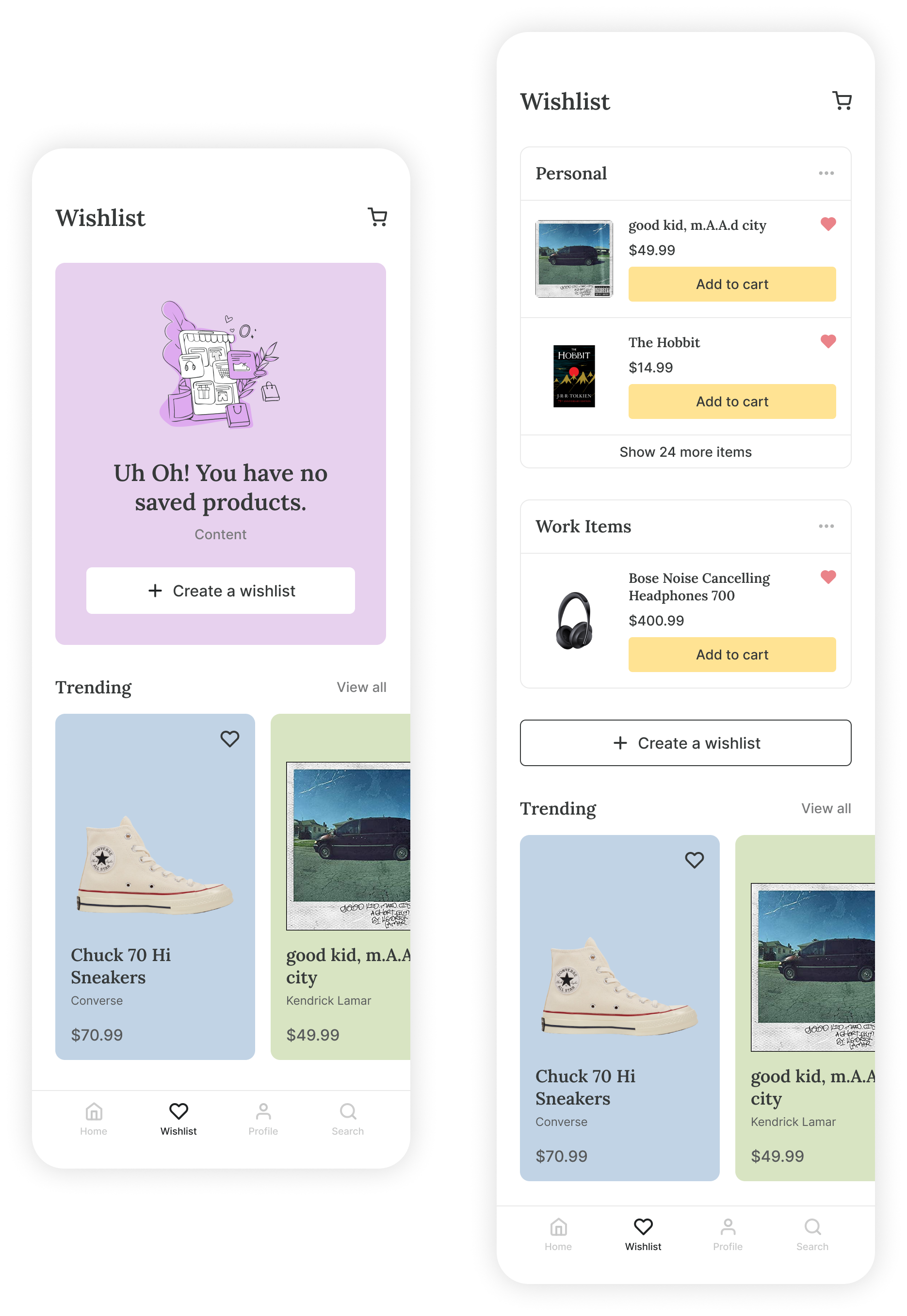
The user has the option to make a wishlist, which he can access through the menu bar on the bottom for ease of use. I decided to design two wishlist screens, one empty and one with items. Regardless of the wishlist screen state, both screens give an option for a user to create a wishlist with one click of the button.
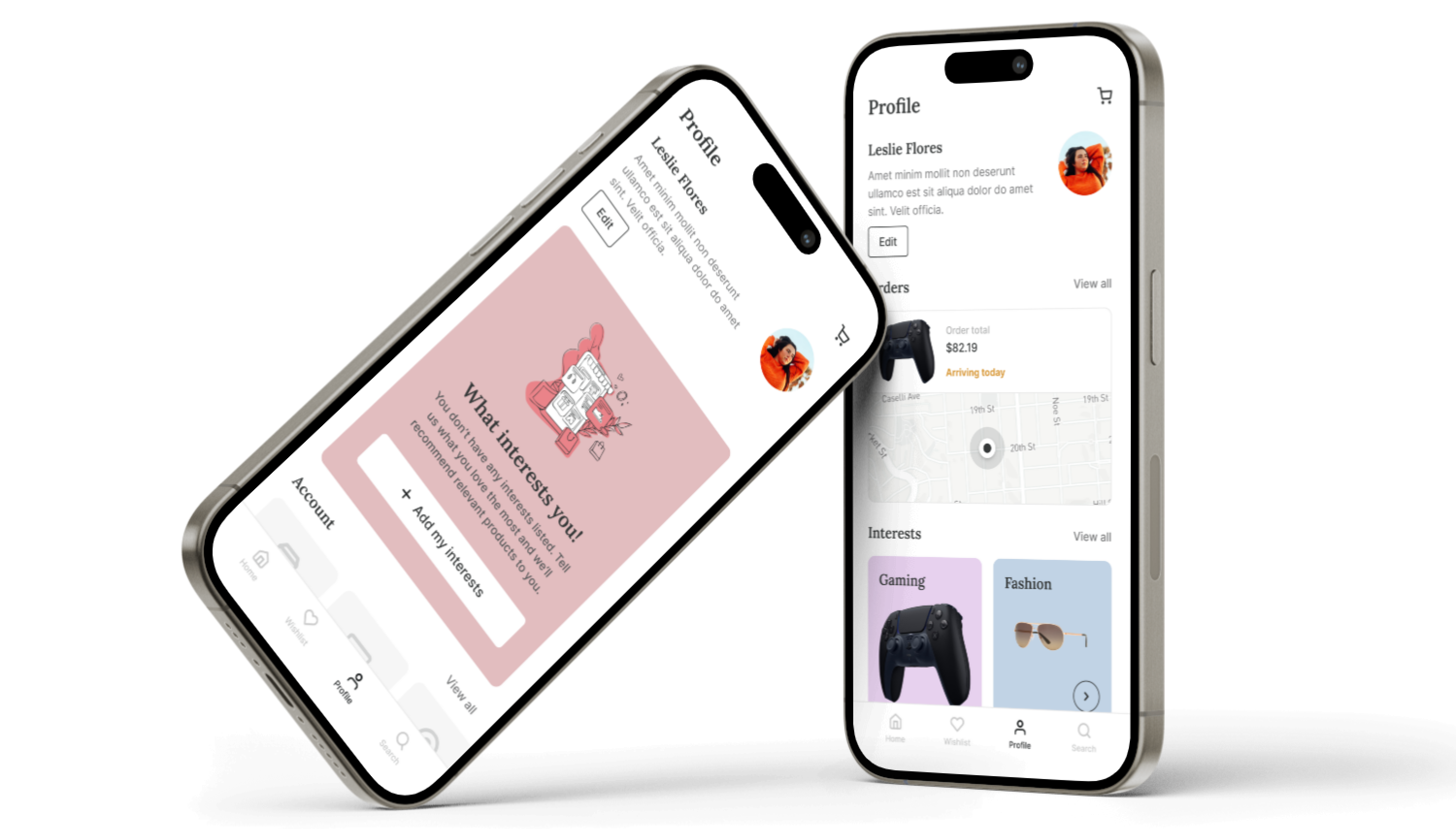
Similarly to wishlist screens, there are two different profile screens for members. The one on the left is shown if the user does not have any pending orders or interests. Because of that, this screen gives an option to add your interests. The one on the right shows pending orders and interests the user selected before.
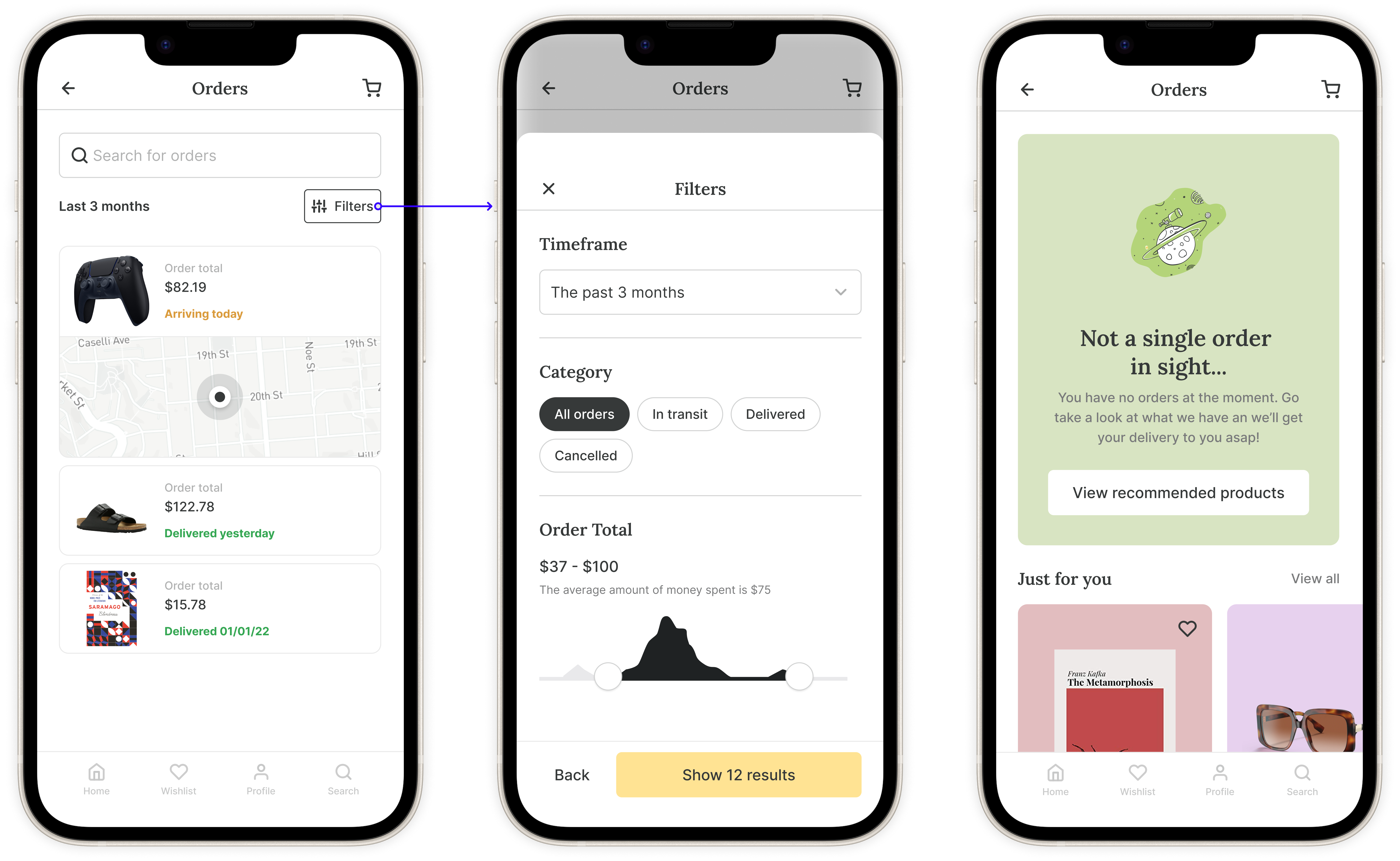
In the "Orders" screen user can follow his pending order and see his order history. Since one user can have a lot of different orders, there is a filter button that opens up an overlay with different options to see only the orders the user wants. This makes it much easier to track your orders just in a few clicks, instead of scrolling indefinitely looking for the one you need. If there are no orders, the user can click on the "View recommended products" button which will continue his flow of looking for the product he wants.
A perfectly smooth search experience is one of the main factors in the success of an application like this. Having that in mind, once the user starts typing in the search bar, both recommendations and typeahed text appear with relevant results, allowing the user to find what he is looking for more easily. The search results screen has a filters button, where the user can sort and select different categories for his search results, making it more precise in product search.
I firmly believe that the design process and system are what make all the difference. Why? It is much easier to make changes in the beginning than later in the project. Here I will walk you through the process from low-fidelity to high-fidelity I used to design this application. After each step, the idea is to communicate with the team and make changes if necessary. I will show you some of the components and styles I created to make my workflow more efficient later.
These are the hand-drawn sketches that I made as the first step in getting an idea of how the product should work. This is where the brainstorming takes place.
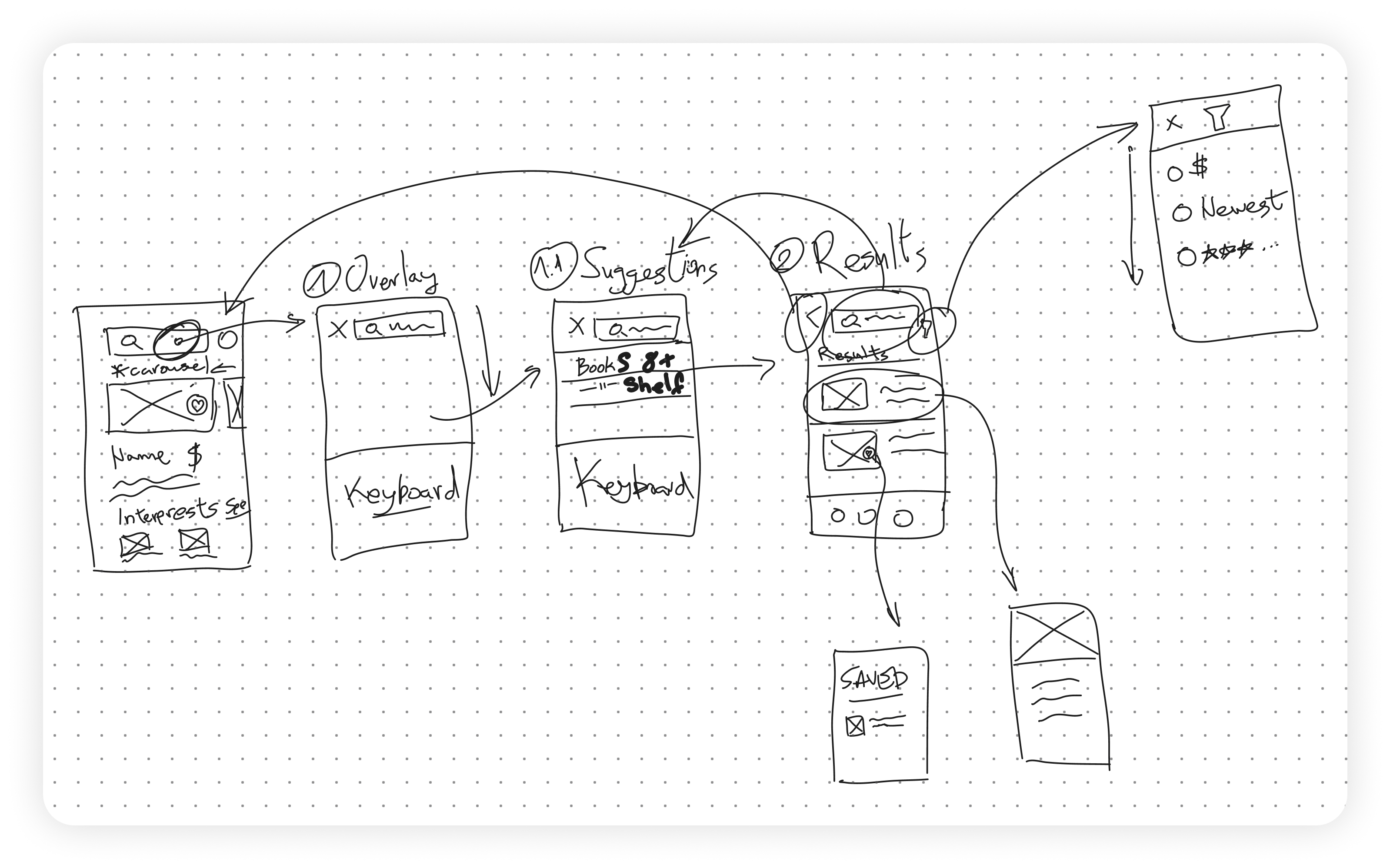
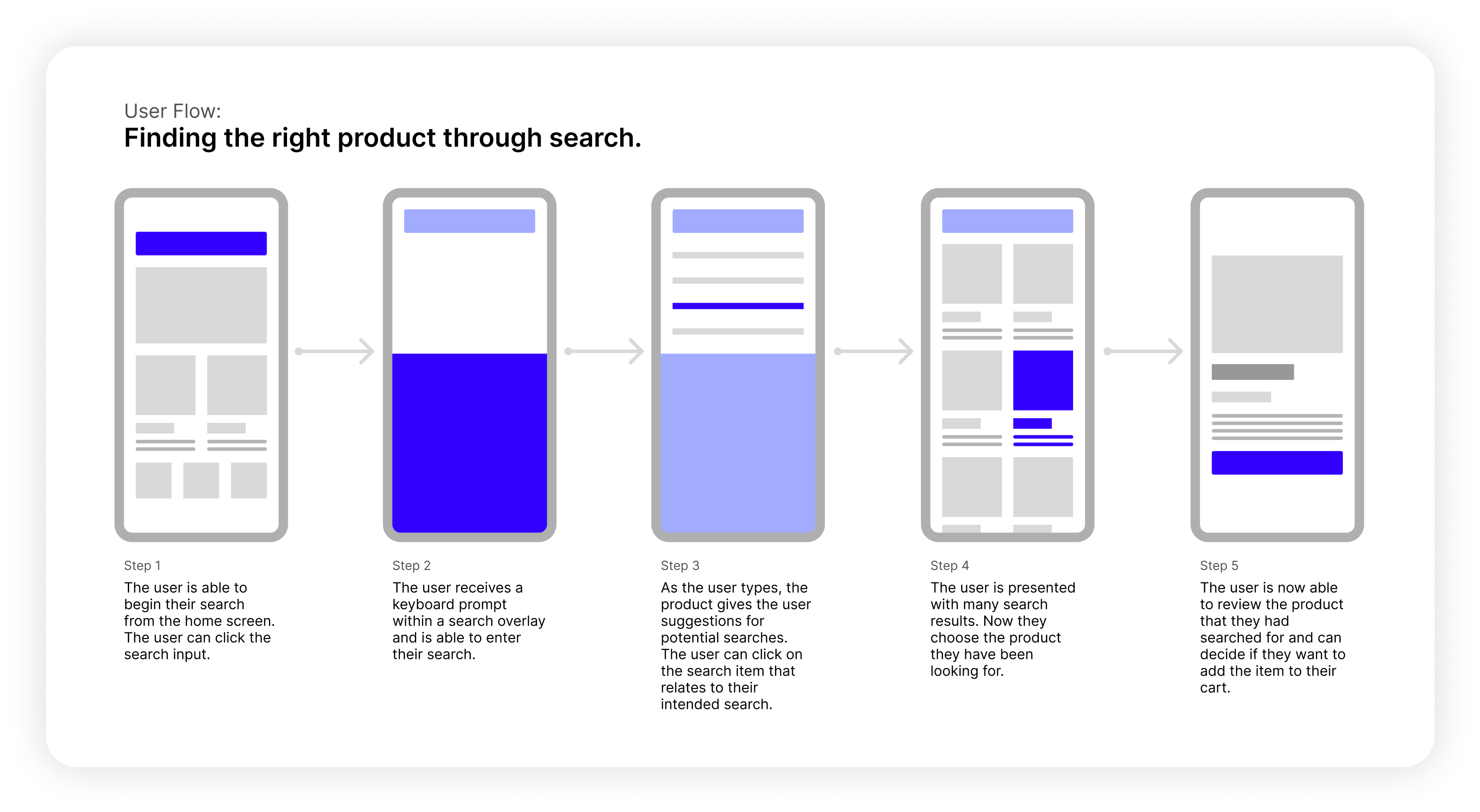
After sketches, I create different user flows, with each step shortly explained, so that I can present it to the team and discuss with them possible mistakes and new ideas. This is where we get the general idea of the work ahead of us.
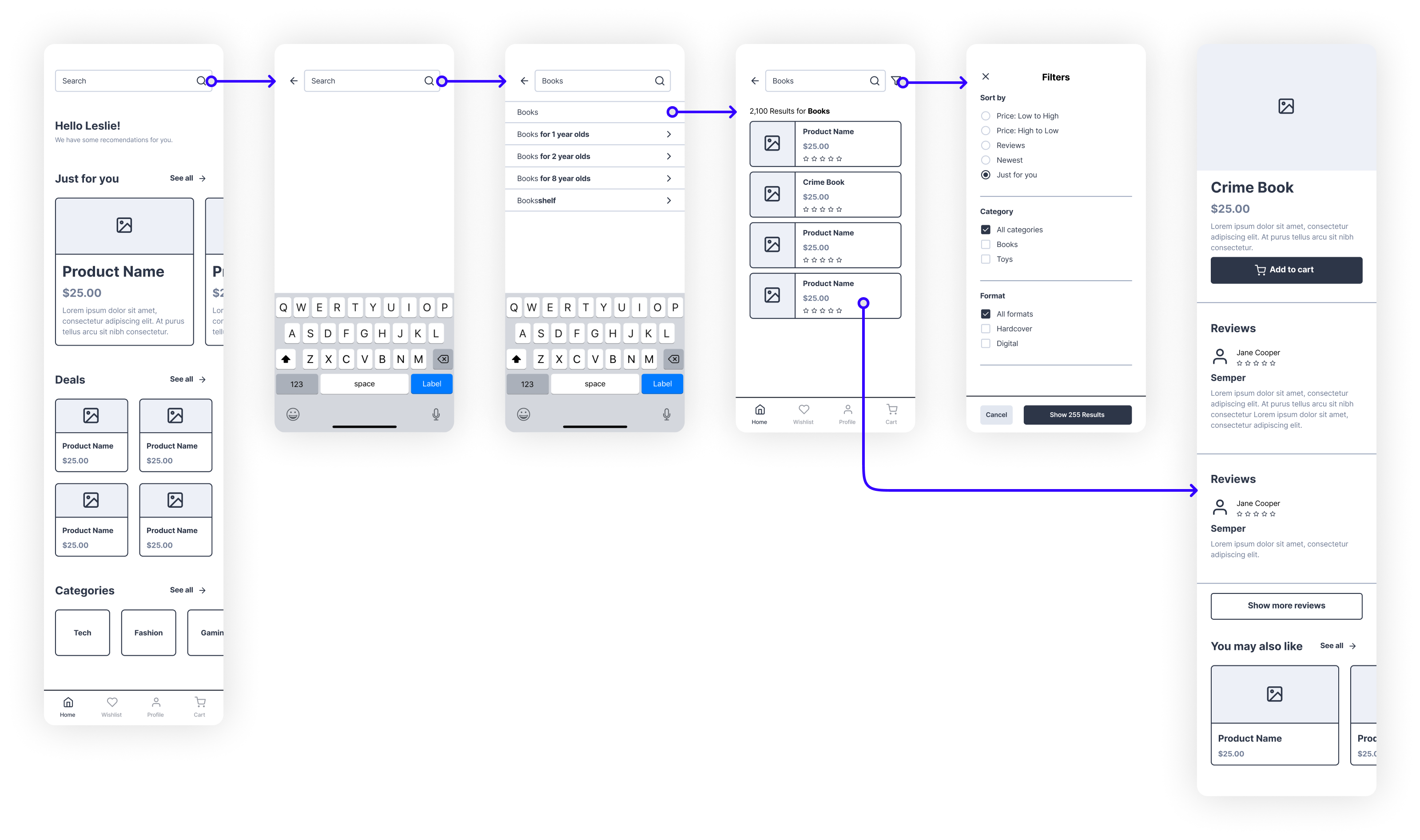
To get a more detailed look at the product, without spending too much time on details, I use wireframes. This way I can show how individual items would interact with each other and make simple prototypes to present to the team/client. This is where we establish the skeleton of the product.
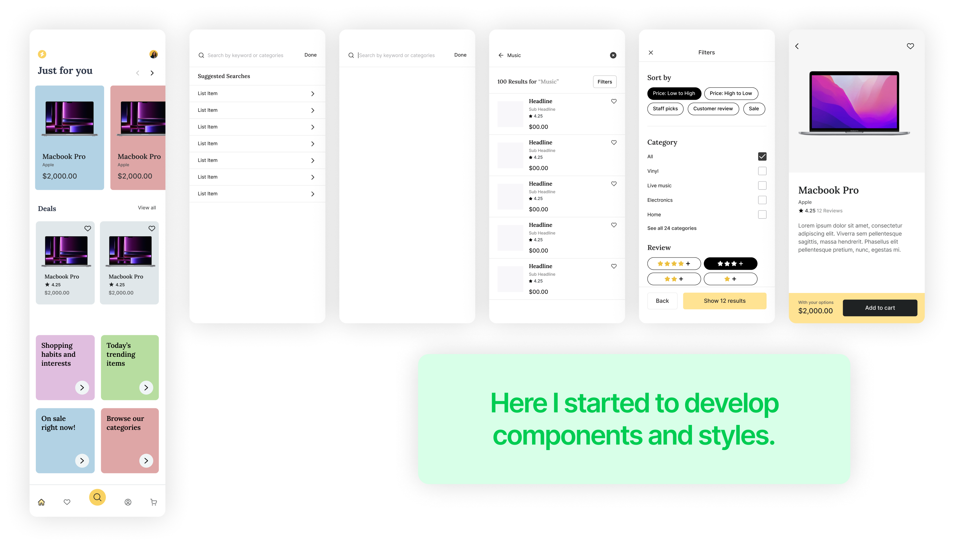
This is the point where I start getting into the details. I create screens with more fidelity while using wireframes as guides. Here I get the idea of different components and styles I would create. I experiment with different colors, fonts, gaps, and everything visual. This is where visual exploration of different elements takes place.
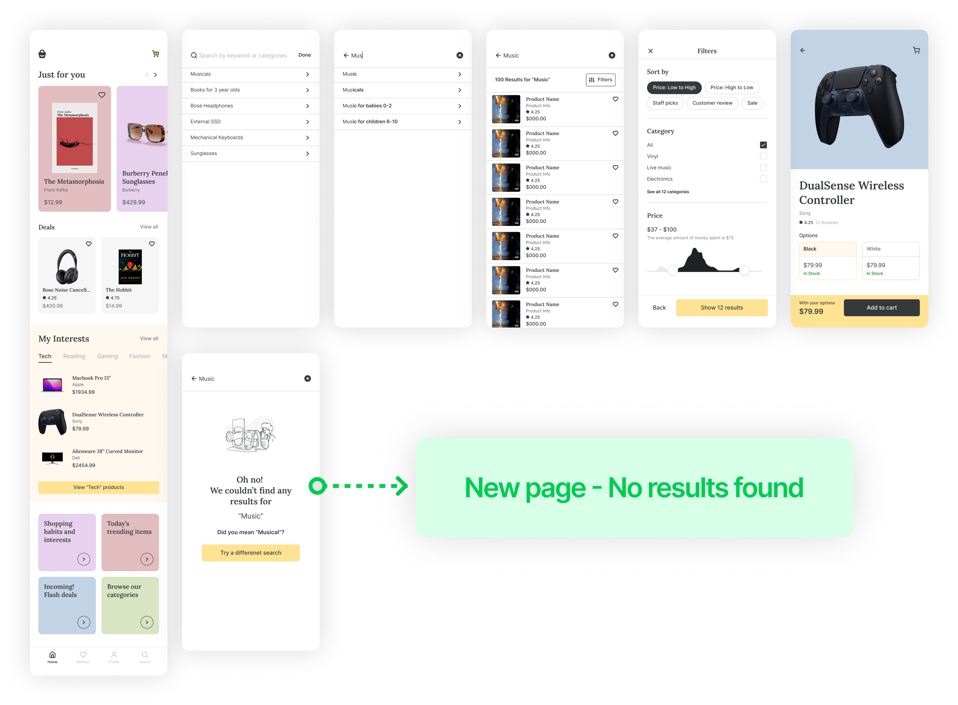
Finally, after we reached a consensus about ideas and visuals, I started working on the final designs. This is where every step I took before makes sense. Everything combines to form functional final designs ready for use. Here I use components and styles I created previously. This does not mean the work is done. Even at this step, I found out I forgot about the “no search results” page, so I designed it here.
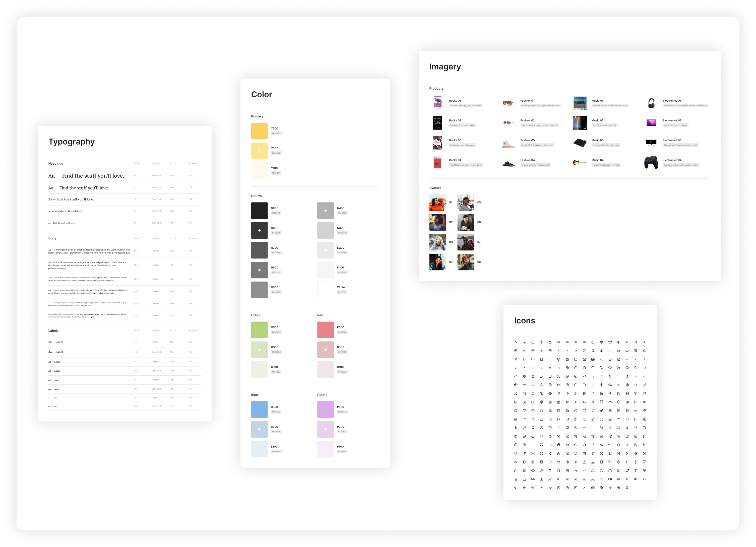
I decided to create typography, color, imagery, and icon styles to make sure my designs were consistent across different pages.
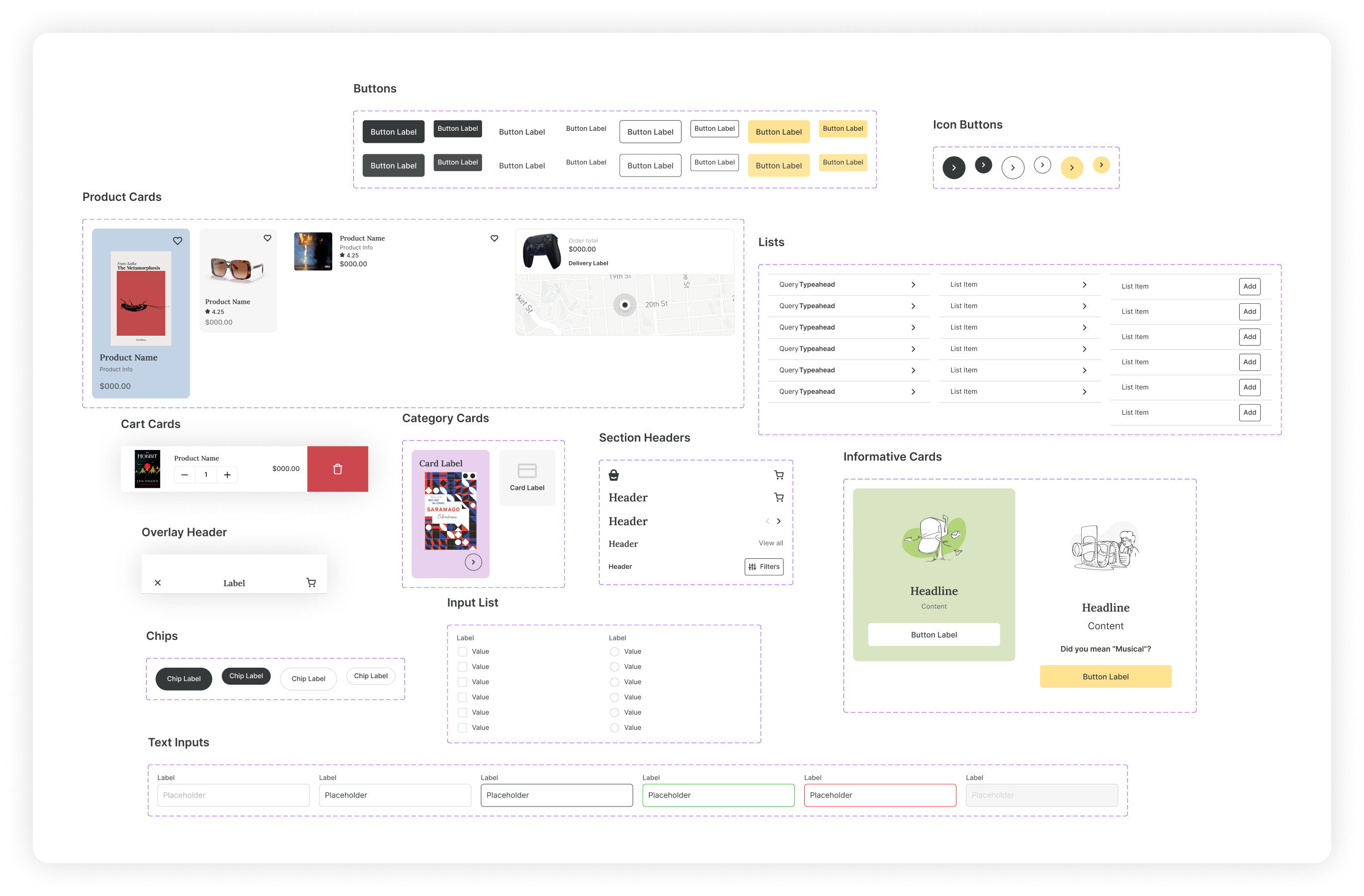
These are some of the components I made to make my work more efficient.
